Available configurations
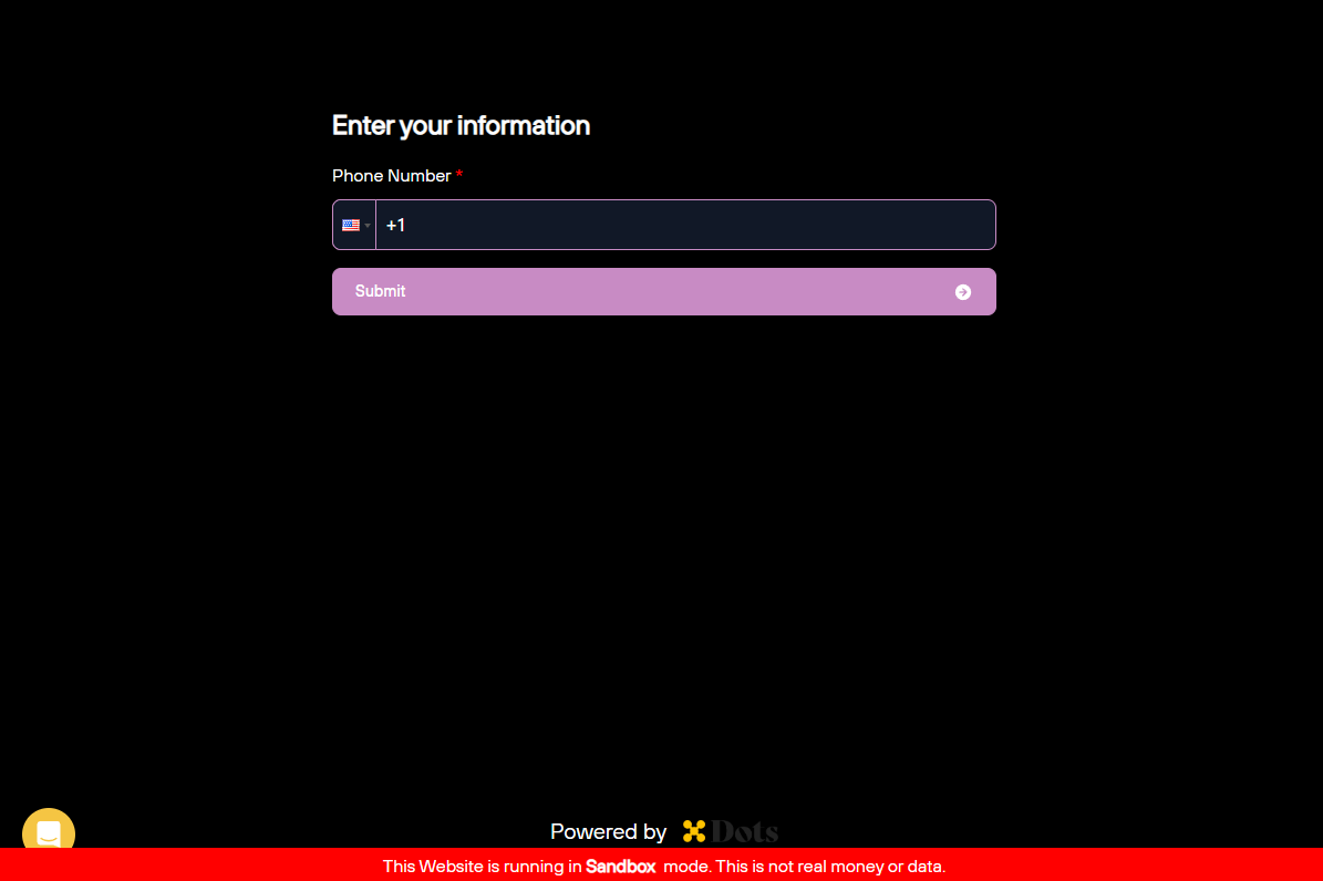
You can customize the Flows’ appearance by changing the theme and CSS variables. Thetheme parameter controls the overall appearance of elements that cannot be individually configured, such as the Dots logo or the date picker icon. The available themes are:
light(default)dark
| Variable | Description |
|---|---|
backgroundColor | Background color of the flow. |
primaryTextColor | Color of texts used in titles and labels. |
secondaryTextColor | Color of secondary texts used in sub-labels and buttons. |
tertiaryTextColor | Color of tertiary texts, such as the default payout method indicator or the Visit dashboard link. |
primaryColor | Primary color of the flow theme, such as button hovers or highlights. |
tabBackgroundColor | Background color of the rail tab. |
tabHoverBackgroundColor | Background color of the rail tab when the cursor hovers over it. |
tabBorderColor | Border color of the rail tab. |
tabHoverBorderColor | Border color of the rail tab when the cursor hovers over it. |
buttonBackgroundColor | Background color of action buttons located at the bottom of each flow page. |
buttonTextColor | Text color of action buttons located at the bottom of each flow page. |
buttonHoverTextColor | Text color of action buttons when the cursor hovers over them. |
buttonHoverBackgroundColor | Background color of action buttons when the cursor hovers over them. |
buttonDisabledBackgroundColor | Background color of action buttons when they are disabled. |
buttonDisabledTextColor | Text color of action buttons when they are disabled. |
inputBackgroundColor | Background color of inputs such as checkboxes or text fields. |
inputBorderColor | Border color of inputs. |
inputPlaceholderColor | Placeholder color of inputs. |
borderRadius | Border radius of buttons, tabs, icons, and inputs. |
Customizing a Flow
To apply the custom styling to your Flow, follow the steps:- First, you need to stringify the configurations, including
themeandvariables, converting the configurations to a JSON string. - URL encode the JSON string.
- Append the encoded string as a
?styles={url_encoded_config}query parameter to the Flow link when attaching it to an iframe.